ExagonMed
client
ExagonMed was a start-up company, producing their own oral spray supplements for start addressing benefits such as calmness, focus, and burnout recovery.
assignment
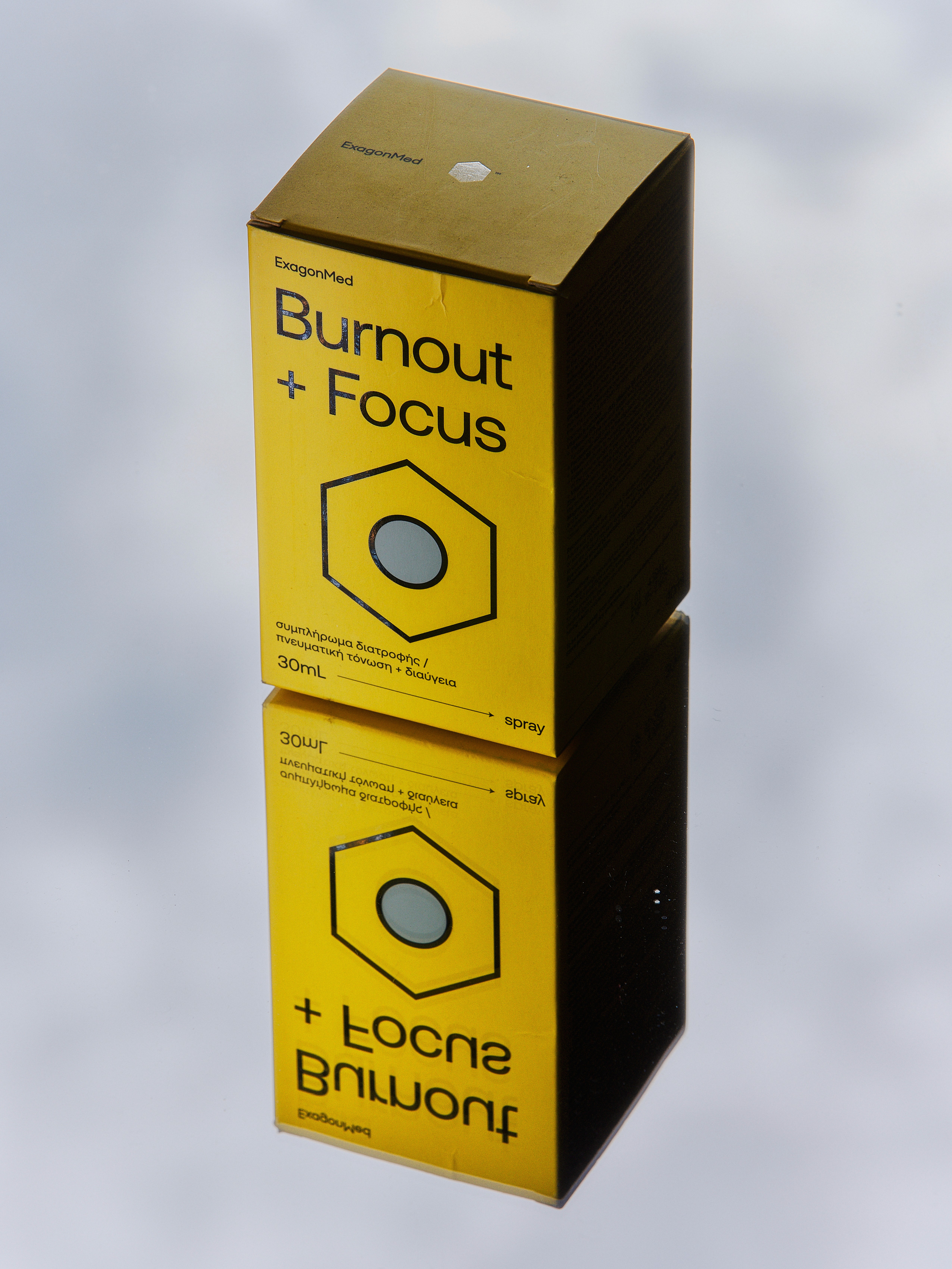
Exagon Med was developed as a contemporary identity and packaging system for a line of oral spray supplements addressing benefits such as calmness, focus, and burnout recovery. The logo is built on a clean, neutral sans-serif wordmark paired with a solid hexagon — a direct and recognizable structural element. The hexagon becomes the core visual device across the system, referencing both precision and molecular logic.
deliverables
Brand Identity, Packaging
client
ExagonMed
year
Unpublished


project analysis
Each product clearly communicates its benefit through large, highly legible sans-serif typography positioned prominently within the layout. At the center, a stroked hexagon contains an abstract circular symbol representing the functional promise of each spray: a setting sun for Instant Calm, a centered circle for Focus, and similarly reduced metaphors for other benefits. The color system is fresh and direct, assigning distinct tones to each function, lavender for calm, yellow for focus, structured in a strict two-color approach using black for text and outlines. The result is a minimal, confident medical-wellness identity that prioritizes clarity and instant recognition. Although the brand was fully developed, it was never launched due to company restructuring. The project remains a complete identity system translating functional wellbeing into a clear geometric language.